
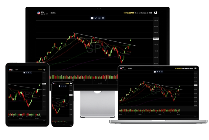
If you use apps every day, you see charts everywhere. Fitness apps show your steps. Weather apps show temperature lines. Finance apps show gains and losses. Study apps show progress. All these apps use charts to explain data in a way that makes sense. One tool that helps developers create these charts is called uCharts. If you build apps, work with data, or love coding simple visual tools, you may have heard of it. Or maybe you saw someone mention it in a coding group and wondered what it was. So what is uCharts? Why do people use it? How does it work? And why do developers say it is one of the easiest chart tools to use?
Let’s break it all down.
What uCharts Really Is
uCharts is a tool that helps developers make charts. Not just any charts. Clean charts. Fast charts. Charts that look modern. Charts that load quickly on phones, tabs, and websites.
It was made for developers who use things like uni-app, Vue, and other small app frameworks. But anyone can use it if they work with JavaScript.
uCharts lets you create things like:
• Line charts
• Bar charts
• Pie charts
• Ring charts
• Area charts
• Radar charts
• Scatter charts
• Heat maps
• Gauge charts
• Mixed charts
In short, almost any chart you see in modern apps can be made using uCharts.
Why Developers Love uCharts
There are many chart tools out there. But uCharts stands out for some simple reasons.
Easy to use
You do not need deep coding knowledge. The setup is simple. Copy. Paste. Adjust.
Works on phones
Designed for mobile apps. Runs smooth. No lag.
Multiple chart types
One tool gives you many chart designs.
Lightweight
Does not slow down apps. Good for small apps or simple projects.
Customizable
Change colors. Layouts. Labels. Styles. Everything.
Supports uni-app
If you build mini apps for WeChat, Alipay, TikTok, or any uni-app system, uCharts fits right in.
Good documentation
Clear steps. Examples. Ready-to-use code.
Reusable
You can use it again and again in different projects.
Open and flexible
You can modify things based on your needs.
Developers love tools that save time. uCharts does exactly that.
What You Can Make With uCharts
Let’s look at popular chart types you can build.
Line Chart
Shows data over time.
Example uses:
• Temperature change
• Daily steps
• Monthly sales
• Study progress
Bar Chart
Good for comparing things.
Example uses:
• Score comparison
• Product sales
• City population
• App user groups
Pie Chart
Shows how something is divided.
Example uses:
• Expense breakdown
• Market share
• Poll results
• Time usage
Ring Chart
A more modern pie chart. Clean and pretty.
Area Chart
Line chart with color filled below the line. Good for trends.
Radar Chart
Shows strengths and weaknesses.
Example uses:
• Player stats
• Skill charts
• Product features
Gauge Chart
Looks like a speedometer.
Example uses:
• Heart rate
• Performance score
• System load
Scatter Chart
Shows random data points.
Example uses:
• Fitness results
• Stats in science
• Data experiments
Heat Map
Shows intensity using color.
Example uses:
• Sleep patterns
• Temperature zones
• Work hours
With uCharts, you can build all these without stress.
How uCharts Works Behind The Scenes
Let’s make this simple.
You give uCharts your data.
You choose the chart you want.
You set the rules (colors, labels, size).
uCharts turns that into a clean chart.
It uses JavaScript and canvas technology to draw charts. Canvas means it draws everything pixel by pixel. That gives full control and smooth results. It also adjusts well to screens of all sizes.
Who Uses uCharts Most
uCharts is used by:
• App developers
• Students making projects
• Teachers building learning tools
• Business dashboard makers
• Freelancers
• Startups
• Data teams
• Web designers
It is common in small apps, mini apps, and dashboards because it is light and fast.
Why Small App Developers Love uCharts
Mini apps need tools that are light and fast. Big chart libraries can slow things down. uCharts was built with small apps in mind.
Here is why mini app developers like it:
Works in uni-app
• Works in WeChat mini programs
• Works in H5 pages
• Works in mobile apps
• Quick to load
• Easy to integrate
• Good mobile support
Small apps grow fast when the user experience is smooth. Good charts help with that.
Read More: Dairyland Insurance
How uCharts Helps You Understand Data Better
Charts make hard things simple. uCharts helps you by showing numbers as pictures.
Instead of reading:
Day 1: 5500 steps
Day 2: 7200 steps
Day 3: 6800 steps
You get a line chart. One quick look and you know the trend.
Humans understand pictures faster than numbers.
The uCharts Ecosystem
uCharts gives more than just simple charts. It also offers things like:
Events
Tap events. Touch events. Lets you make interactive charts.
Animations
Charts can move. Grow. Slide. Fade.
Themes
Dark theme. Light theme. Custom colors.
Plugins
Extra features for special needs.
API
Let developers control charts fully.
How To Start Using uCharts
Let’s keep it easy.
Step 1
Download uCharts or install it with your framework.
Step 2
Create a new project.
Step 3
Import the library.
Step 4
Prepare your data.
Like:
data: [15, 22, 30, 28, 25]
Step 5
Pick a chart type.
type: ‘line’
Step 6
Set options.
Colors. Titles. Axis. Labels.
Step 7
Render the chart.
And you are done.
Common Places Where You See uCharts
You see it almost daily without knowing.
Fitness apps
Steps, calories, heart rate.
School apps
Results, learning growth.
Weather apps
Temperature charts.
Finance apps
Income, savings, crypto prices.
Shopping apps
Sales charts.
Task apps
Work progress.
Dashboard apps
Analytics and reports.
Any app with numbers can use uCharts.
Why Beginners Like uCharts
New developers often feel scared of chart libraries. They look big. Complicated. Full of settings.
But uCharts is friendly for beginners because:
• Copy paste examples work
• Simple options
• Good support
• Many ready-made templates
• Easy to use even with basic coding skills
• Videos and guides everywhere
Even students use it for school projects.
Why Experts Like uCharts
Experts like tools that give power and control.
uCharts allows:
• Custom canvas drawing
• Custom animations
• Complete chart control
• Large data support
• Integration with big projects
• Performance tuning
• API-level changes
So beginners and experts both enjoy using it.
Comparing uCharts With Other Tools
Let’s compare in simple words.
uCharts vs ECharts
uCharts is lighter. Better for mini apps. ECharts is bigger but more detailed.
uCharts vs Chart.js
Chart.js is great for the web. uCharts is better for mobile apps.
uCharts vs HighCharts
HighCharts is strong but heavy. uCharts is perfect for quick charts.
uCharts vs custom drawing
Custom drawing is slow. uCharts saves time.
Problems You May Face And How To Fix Them
Nothing is perfect. But most issues are small.
Charts look blurry
Use the right pixel ratio and canvas settings.
Chart does not show
The import path may be wrong.
Touch does not work
Enable touch events in settings.
Data looks weird
Your numbers may not be in the right format.
Slow on old phones
Reduce animation settings.
Most issues are simple fixes.
Why uCharts Will Keep Growing
Charts are a big part of apps now. As data grows, chart tools grow too. uCharts keeps getting updates and new features.
Reasons it will stay popular:
• More mini apps every year
• More data apps
• More dashboards
• More mobile-friendly tools
• Developer-friendly tools needed
• Community keeps growing
Simple tools always win.
uCharts is one of the easiest chart tools for developers today. It helps you make clean, modern, fast charts for mobile apps and websites. Whether you are a new coder, a student, a freelancer, or a company developer, uCharts makes data look good.
It is simple. It is fast. It is powerful. And it works everywhere.
If you want charts that load quickly, look pretty, and help users understand data, uCharts is a great choice. Apps need clear visuals. Data needs a story. uCharts helps you tell that story in the simplest way.