

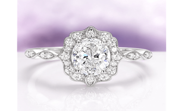
Few gemstone combinations have held their place in jewelry design as steadily as sapphire and diamond. One stone brings saturated color, the other brings colorless brilliance, and together they create a balance that feels neither loud nor plain. The pairing shows up across generations and design eras precisely because it solves a visual problem elegantly: how to give a piece a clear focal point while surrounding it with light. This is a design explainer, not a shopping guide, so the goal here is to understand why the two stones flatter each other and how designers use that relationship to shape a finished piece.
Color Against Colorless: The Contrast That Carries the Design
The heart of the pairing is contrast. Sapphire reads as a defined, cool hue – most often blue, though the stone occurs in many colors – while diamond reads as clear and reflective. Placed side by side, each makes the other more legible. The diamond looks brighter because a colored neighbor gives the eye a reference point, and the sapphire looks richer because a colorless frame keeps nothing competing with its tone. This is the same principle painters use when they set a saturated shape against a neutral ground. Neither element has to shout, because the difference between them does the communicating. For anyone curious about how the stone relates to other cool-toned options, it helps to understand where sapphire sits among the blue gemstones before looking at how it behaves next to a colorless partner.
How Accent Diamonds Direct the Eye
Accent diamonds are not just decoration; they are wayfinding. When small colorless stones ring or flank a colored center, they behave like an arrow, drawing the gaze inward toward the focal gem. The eye naturally travels from bright, scattered sparkle to the calm, saturated middle, and it settles there. Designers rely on this movement to give a piece a clear reading order. Without accents, a lone colored stone can feel isolated on a wide expanse of metal. With them, the composition gains a rhythm – sparkle, then color, then sparkle again – that keeps attention circulating rather than drifting off the edge.
Halo, Three-Stone, and Accented-Band Logic
Most sapphire-and-diamond layouts fall into a few recurring structures, and each one solves a slightly different problem. Understanding the logic matters more than memorizing names.
- Halo: a continuous ring of small diamonds encircles the sapphire. This maximizes contrast right at the boundary of the center stone, making the color look framed and often making the center appear larger than it measures.
- Three-stone: a central gem is flanked by two companions. When a sapphire sits between two diamonds, the arrangement reads as balanced and symmetrical, and the color anchors the middle while the flanking brilliance widens the visual span.
- Accented band: smaller stones travel along the shoulders rather than clustering at the center. This spreads light down the sides and lets the focal stone stand relatively open, with sparkle leading the eye toward it from a distance.
None of these is inherently better. They are different answers to the question of where you want light concentrated and how much you want the color to dominate.
Brightness and Light Return
Part of why the combination endures is that the two stones handle light differently, and those differences complement rather than clash. Diamond has high refractive brilliance and disperses light into flashes, so it acts as the piece’s source of movement and life. Sapphire, being colored and typically cut to hold its saturation, returns a deeper, steadier glow. The result is a two-speed effect: quick, scintillating sparkle from the accents and a slower, more constant color from the center. A design that leaned entirely on one or the other would feel either restless or static. Combining them gives a piece both energy and gravity, which is a large part of why the look never feels dated. The interplay of a sapphire and diamond engagement ring is often described as timeless for exactly this reason – the light behavior is balanced by design, not by trend.
Balancing Proportions
Proportion is where a good pairing succeeds or fails. If the accents overwhelm the center, the color loses its role as the focal point and the piece reads as a field of sparkle. If the center dwarfs the accents, the supporting stones look like an afterthought and the composition tips out of balance. Skilled design keeps a deliberate ratio between the focal stone and its surroundings, so the eye understands immediately which element leads. Scale also interacts with the metal: the amount of visible metal between and around the stones changes how heavy or airy the whole piece feels. Proportion, in other words, is not only about stone sizes but about the negative space that lets each element breathe.
When a Solitaire Sapphire Stands Alone
For all the strength of the pairing, there are moments when a sapphire is best left unaccompanied. A solitaire setting puts the entire weight of the design on a single stone, which suits a sapphire with exceptional color or an unusual hue that deserves an uninterrupted stage. Without surrounding brilliance, the eye has nowhere else to go, so every quality of the stone – its saturation, its cut, its clarity – becomes the whole story. A solitaire also reads as quieter and more modern, trading the framed formality of accents for a clean, confident simplicity. Choosing between a solitaire and a paired design is really a choice about whether you want the stone to speak by itself or in conversation with light around it.
The Takeaway
The sapphire-and-diamond pairing endures because it is built on a genuine design principle rather than a passing fashion. Color and colorless brilliance make each other more visible; accents guide the eye and set a focal point; brightness and depth combine into a balanced kind of movement. Whether expressed as a halo, a three-stone, an accented band, or set aside entirely in favor of a solitaire, the underlying logic stays the same. Understanding that logic is what lets you look at any piece and see not just two beautiful stones, but the quiet reasoning that keeps them looking right together decade after decade.